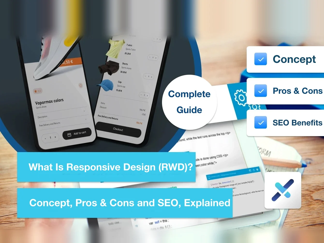
In today's diverse device landscape, responsive web design (RWD) has become almost standard in website design. Whether on a phone, tablet, or desktop computer, the goal of RWD is to give your website a consistent and comfortable browsing experience on any device.
If you're not yet familiar with this concept, or you want to understand its SEO advantages, this article is for you!
What's the difference between RWD and AWD? And what is a mobile website?

When discussing RWD, people often mention AWD (Adaptive Web Design) and mobile websites. How are these three different?
- RWD (responsive web design): RWD is more flexible. It uses CSS media queries to adjust the content layout automatically, ensuring a consistent user experience across all kinds of devices.
- AWD (adaptive web design): AWD provides multiple preset layouts for different devices and loads the matching design based on device characteristics, making it suitable for more complex needs.
- Mobile website: A mobile website is a separate version designed specifically for mobile devices, usually with a different URL from the desktop version (for example, m.example.com). While it costs less, maintaining two different versions of a website increases the workload.