Many companies treat shopping website design as making the site look good.
But customers come to an online store to find a product, check the options and price, and place an order.
If any one of those steps gets stuck, the order is lost, however good the pages look.
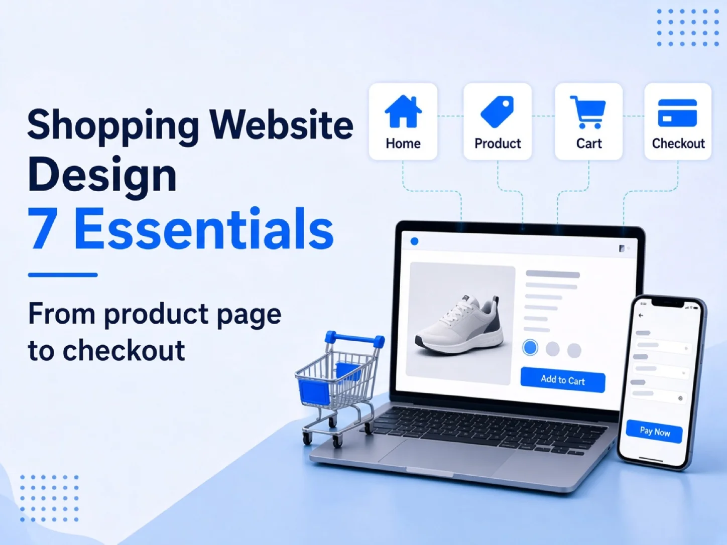
This article follows the customer's path to purchase and walks through seven essentials of shopping website design. It also covers how to design for products with complex options or quote requests.
Key points
- The goal of shopping website design is to help customers find a product and finish the order.
- Before designing, decide how you sell: direct checkout, quote requests, or both.
- Keep checkout fields to a minimum. Most sites need only eight.
- For products with complex options, turn the questions sales would ask into steps on the page.
- A platform theme is enough for standard retail. Consider custom design when your buying process is unusual.
How is a shopping website different from other websites?
A company website introduces the business, builds trust, and asks visitors to get in touch.
A shopping website adds a transaction. Customers need to find a product, compare options, add it to the cart, and pay.
So ecommerce website design has to care for every step of that transaction, not only the brand look.
| Company website | Shopping website | |
|---|---|---|
| Main goal | Introduce the company, get inquiries | Get customers to buy or request a quote |
| Main pages | Home, about, services, case studies | Category pages, product pages, cart, checkout |
| Design focus | Clear message, trust | Easy to find, easy to compare, easy to order |
| How it is measured | Number of inquiries | Orders, conversion rate, cart abandonment |
Design principles every website shares, such as visual hierarchy, branding, and CTAs, are covered in our article on company website design. This article only covers what is specific to shopping websites.
Further reading: Company website design: planning, structure, and what to design for
Before you design, decide how you sell
Two online stores can look very different. A snack shop and a custom uniform maker need different pages.
Answer the four questions below before you start, and the design direction gets much clearer.
Do customers check out directly, or ask for a quote first?
Standard products can go straight into the cart and through checkout.
Products that depend on quantity, material, or lead time are better served by letting customers send a quote request first, with sales replying with a price.
The two flows need different buttons, forms, and follow-up pages, so decide before design starts.
Are your products standard, or do they have many options or custom work?
For products with few options, clear photos and a buy button are enough.
For products with many options, plan the order in which options are chosen, how the price changes with them, and how to warn customers when a combination does not work.
Do customers mainly use phones or computers?
If you already have a website, check the device split in Google Analytics.
If most visitors are on phones, design the product page, cart, and checkout for the phone screen first.
Business buyers often compare specifications on a computer, so the desktop version needs to show more detail clearly.
Are your main customers consumers or businesses?
Consumers care about ordering quickly and seeing promotions.
Business customers may need member pricing, bulk ordering, or invoices.
Our article on ecommerce website features covers how to plan these functions.
7 essentials of shopping website design

The sections below follow the customer from arriving on the site to paying.
1. Homepage: help customers find the way in
The homepage's job is to route customers to the category or product they want.
Above the fold, consider showing:
- One sentence on what the brand mainly sells
- Entry points to the main product categories
- Current promotions or new arrivals
- A search box
With too many carousel slides, the later ones rarely get seen. Put important promotions in a fixed section instead.
2. Navigation and categories: match how customers look for products
Name categories in words customers know, not internal product codes.
If customers look for "class shirts", do not label the category only "cotton T-shirt series".
Keep the category tree shallow, so customers reach products within two or three clicks.
Google recommends linking from the menu to category pages, and from category pages to every product page. If a category page does not link to all its products, Google may miss some of them.
Further reference: Google Search Central: Ecommerce Website Navigation Structure
3. Product listing pages: filters and sorting that fit how people compare
Once you have many products, customers need filters and sorting.
Design filters around the product. Clothing is filtered by size and color; printing by size and paper.
Every product card needs at least a photo, a name, and a price. For quote-only products, show "Priced by specification" so customers do not think the price is missing.
4. Product page design: options, price, and decision details in one place
The product page is where customers decide whether to buy. Product page design should answer the main questions they have before buying.
| Section | What customers want to know |
|---|---|
| Product photos | What it really looks like, details, and size |
| Name and price | How much it costs, any discounts |
| Option selection | Which sizes, colors, and materials are available |
| Buy button | Add to cart or send a quote request |
| Shipping and payment | When it ships, shipping cost, how to pay |
| Product description | Use, material, care |
| Reviews or case studies | What other buyers thought |
When customers change an option, update the price and photo at the same time.
That way, they do not find out at checkout that the price is not what they expected.
5. Cart and checkout: fewer fields, no surprise fees

Checkout is the step where orders are most often lost.
Baymard Institute's research on US online shoppers found that 17% had abandoned an order because checkout was too long or complicated.
Baymard also estimates that large ecommerce sites can raise conversion rates by 35.26% on average by improving checkout design.
Its research also points out that the number of form fields, not the number of steps, is what mainly shapes the checkout experience.
Most sites need only eight checkout fields, but the average in 2024 was eleven.
Further reference: Baymard Institute: Checkout Optimization: Minimize Form Fields
Use these points to check your cart and checkout flow:
- The cart lists products, options, quantities, and subtotals, and customers can edit them there
- Shipping and handling fees appear before checkout, not at the last step
- Guest checkout is available, so customers are not forced to sign up
- Address and invoice forms keep only the fields you need
- The payment methods customers use most come first
6. Mobile: design the main flow for one hand
Phone screens are small, so the main actions should work with one hand.
- Buttons are large enough, with space between them to avoid mis-taps
- The "Add to cart" or "Send quote request" button stays fixed at the bottom of the screen
- Options can be seen without scrolling sideways
- Phone number and quantity fields open a numeric keypad
Ecommerce web design usually uses responsive design, so one site adapts to both phone and desktop screens.
Further reading: What is responsive design? The idea, the tradeoffs, and SEO
7. Trust information: shipping, returns, payment, and contact details
First-time customers check whether a store is reliable.
Make the following easy to find, ideally with a summary on the product page:
- Shipping fees and the free-shipping threshold
- Shipping and delivery times
- Return and exchange policy
- Payment methods
- Company name, registration number, and contact details
- Customer reviews or case studies
How should a shopping website handle complex options and quote requests?
Most advice on shopping website design assumes customers can pick a product, add it to the cart, and pay.
But for products like group uniforms and printing, the price changes with quantity, material, and finishing, and some need confirming before they can be quoted.
The key for these sites is to turn the questions sales used to ask on the phone into choices on the page.
Here are three TimTech projects as examples.
Choose options step by step, not all at once

When there are many options, laying them all out at once leaves customers unsure where to start.
A better approach is to order them the way customers decide: style first, then color, then size and quantity.
哈摩學服 makes class, department, and club uniforms, with products that vary by style, brand, color, and size.
TimTech built a multi-option product structure for 哈摩學服, so customers confirm what they need step by step on a single product page.
Since the site launched, each quote request takes 3–4 fewer rounds of back-and-forth, and the store understands what the customer needs the first time.
Calculate the price from the options in real time

Print pricing depends on paper, size, finishing, and more, so sales traditionally quoted each order by hand.
In the back office of 玖愛印 (9i-in), pricing rules can be set by paper, size, and special finishing.
Once customers finish choosing options on the site, they see the price right away.
With the price shown instantly, customers can compare options themselves instead of waiting for sales to reply.
Since its site launched, 9i-in has gained more than 5,000 new customers.
When customers cannot check out directly, use a quote request flow
Some products can only be priced after quantity, lead time, or custom details are confirmed. For these, "add to cart and pay" does not fit.
A shopping website can replace the buy button with "Send quote request". Customers choose their options, send the request, and sales follow up with a price.
That is how 哈摩學服's site works. After a customer sends a request, the system notifies staff automatically through LINE, so the conversation can continue right away.
The quote request should carry the options and quantity the customer chose, so sales do not have to ask again from the start.
Let customers finish their artwork in the browser
Printing and custom products often stall because customers have no design software, or their files do not meet print requirements.
9i-in added an online editor, so customers who cannot use professional design software can still finish print-ready artwork in the browser.
飛捷數位印刷 lets customers upload files, choose materials and options, and pay online.
For thesis printing near universities, 飛捷 also has a spine editor that helps staff quickly produce correctly formatted thesis covers.
Online orders now make up 20% of 飛捷's orders, and the share is still growing.
TimTech's Enterprise E-Commerce and Online Inquiry System is built for option-based pricing, quote requests, and order handling.
How does shopping website design balance SEO and site speed?
Shopping websites have many pages and frequent product updates, so plan SEO and speed together during design.
| Item | What to watch during design |
|---|---|
| Product descriptions | Give every product its own description instead of copying the supplier's text |
| Filter URLs | Filter combinations create many URLs, so decide which ones search engines should index |
| Product structured data | Gives search results a chance to show price, stock, and reviews directly |
| Images and layout | Compress product images and reserve fixed dimensions so the layout does not shift while loading |
If filter URLs do not need to appear in search results, Google recommends blocking them from crawling to save crawl resources.
Further reference: Google: Managing crawling of faceted navigation URLs
For the format and fields of product structured data, see Google's product structured data documentation.
For speed, Google measures user experience with Core Web Vitals.
Aim to show the main content within 2.5 seconds, respond to interactions within 200 milliseconds, and keep the layout shift score below 0.1.
Further reference: web.dev: Web Vitals
Template, platform theme, or custom design?
There are three common ways to design a shopping website, each suited to different companies.
| Approach | Best for | Limits |
|---|---|---|
| Ecommerce platform theme (SHOPLINE, Shopify, etc.) | Standard retail, launching quickly | Layout and buying flow are limited by the platform |
| Store template (WordPress themes, etc.) | Teams that can maintain the site | With many plugins, you handle updates and compatibility yourself |
| Custom design | Special flows such as option-based pricing, quote requests, multiple languages, or revenue sharing | Higher cost and longer timeline, needs full planning |
If your buying process is the same as standard retail, a platform theme is usually enough. Put the design budget into product photos and copy first.
Custom design is only needed when the buying process is unusual.
For example, NAPA pickleball sells both in Taiwan and abroad, and its site supports Traditional Chinese, Simplified Chinese, and English.
NAPA also promotes through KOLs and coaches. The site has built-in coupons and revenue-share tracking, and the back office calculates the sales each promoter brings in.
NAPA now works with a large number of KOLs, and even as partners are added, each promoter's results are still calculated automatically in the back office.
For the cost of each approach, see our ecommerce platform cost comparison and online store cost guide. Once you decide to outsource, see also how to choose a web studio.
Shopping website design FAQ
How much does shopping website design cost? How do templates and custom design compare?▼
The cost depends mainly on how the site is built, the number of products and options, the functions and flows, and whether payment, logistics, or other systems need to be connected.
Platform themes have the lowest design cost, but you also pay the platform's annual fee and transaction-related fees. Custom design costs more and suits companies with special processes.
For a detailed breakdown, see What does an online store cost? Six factors in a business ecommerce budget.
I already use a platform like SHOPLINE. Do I still need a designer?▼
Not necessarily. Platform themes already include the homepage, categories, product pages, and checkout, which is usually enough for standard retail.
Good shopping website design helps customers finish their order
The results of shopping website design show up in whether customers find the product, understand the price, and complete the order or quote request.
Decide how you sell first, then check the homepage, product pages, and checkout along the customer's path to purchase. That does more than chasing visual effects.
If your products have complex options, need quote requests, or your current platform does not fit how you actually take orders, book a free consultation and let's talk through how to plan your site.